Starbucks Reserve
Brand Expression Refresh
CD: Derek Shimizu
ACD: Marisa Crane
Designers: Myself, Christine Chung
Writer: Maria McNamara
Creative Project Manager: Holly Kauffman
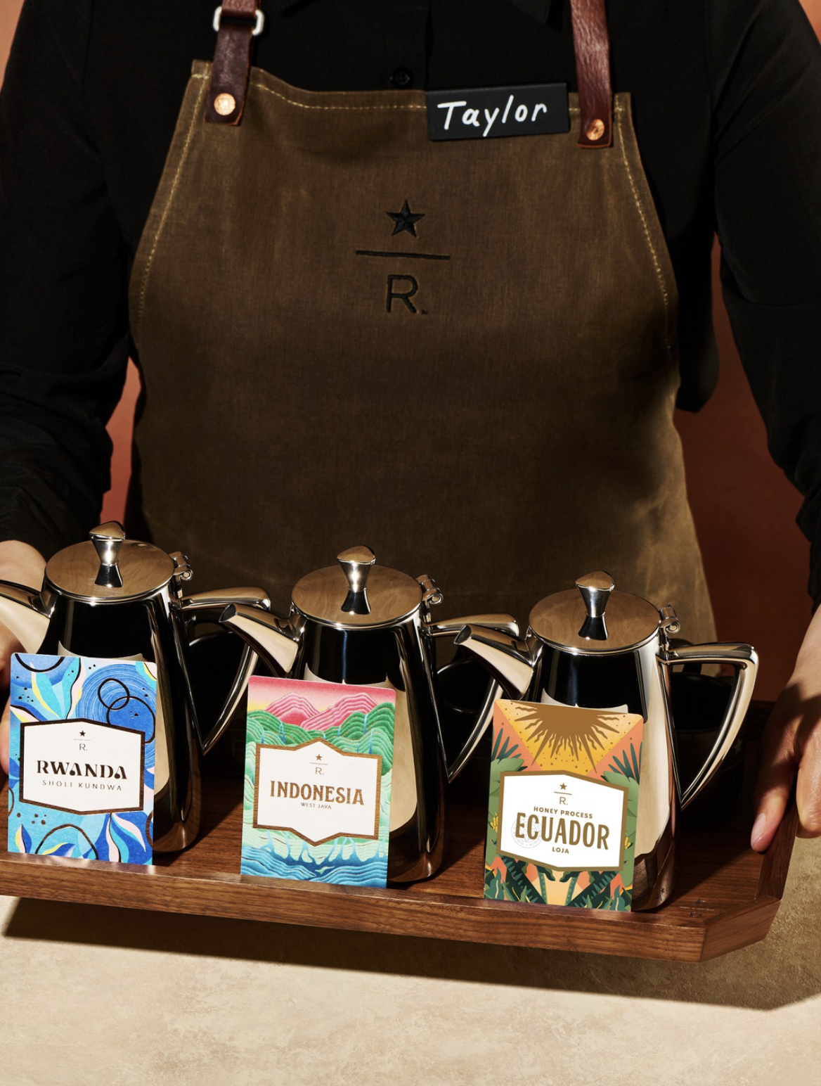
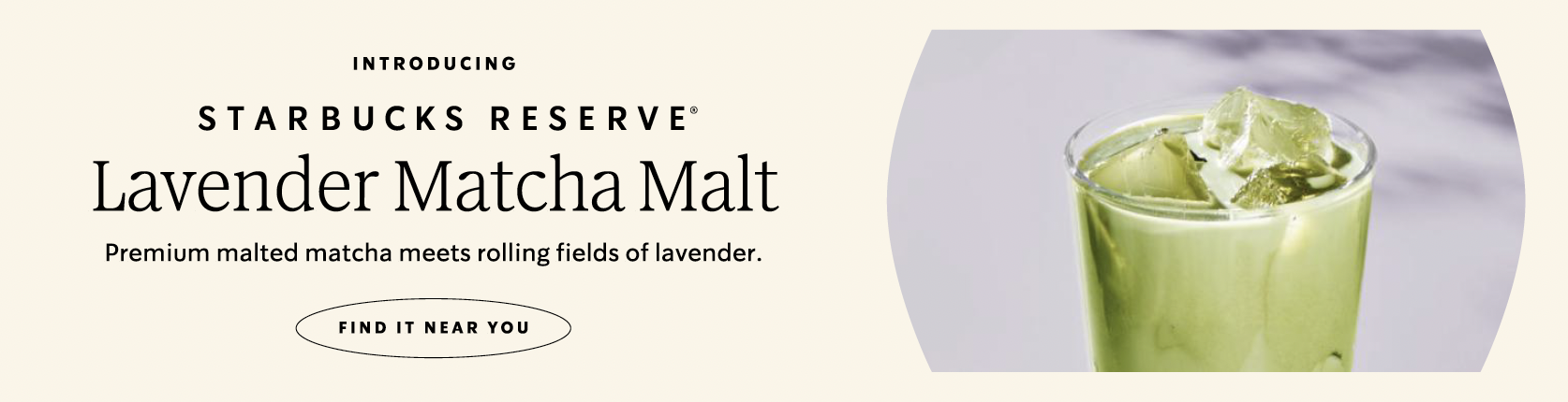
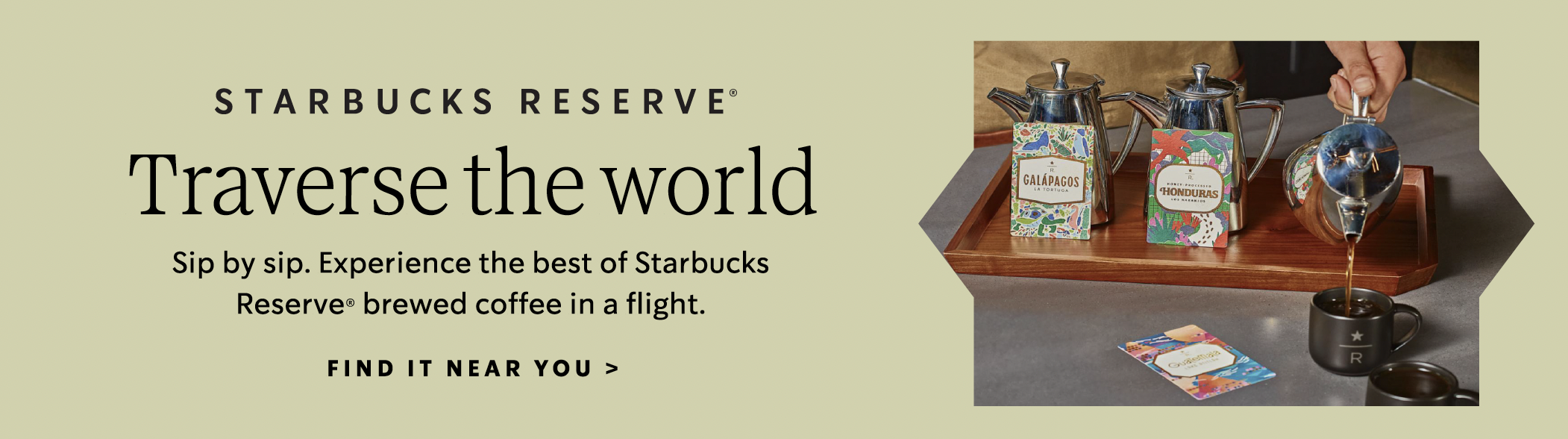
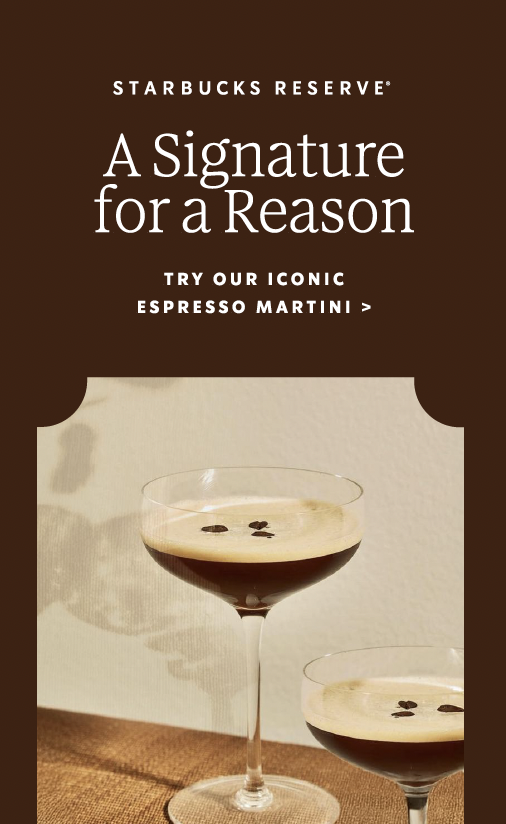
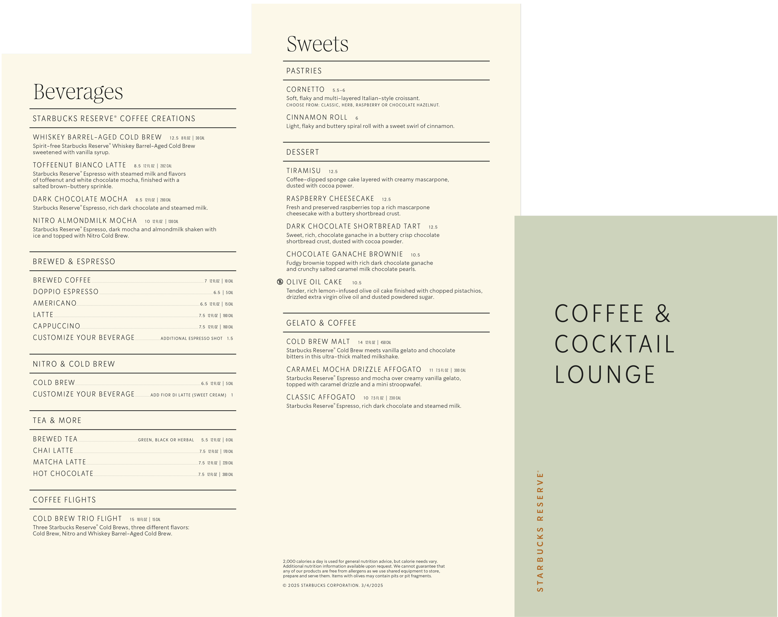
After nearly a decade, Starbucks Reserve was ready for a refresh. As Lead Designer, I worked alongside a team of talented designers and writers to evolve the brand expression, building on its iconic foundation while bringing an elevated and modern point of view to the Reserve experience. We developed a more ownable identity system anchored by brand typography, a refreshed color palette, and a new grid system for all menus, signage, and digital OOH creative, creating a visual language that felt both premium and distinctly Starbucks Reserve.
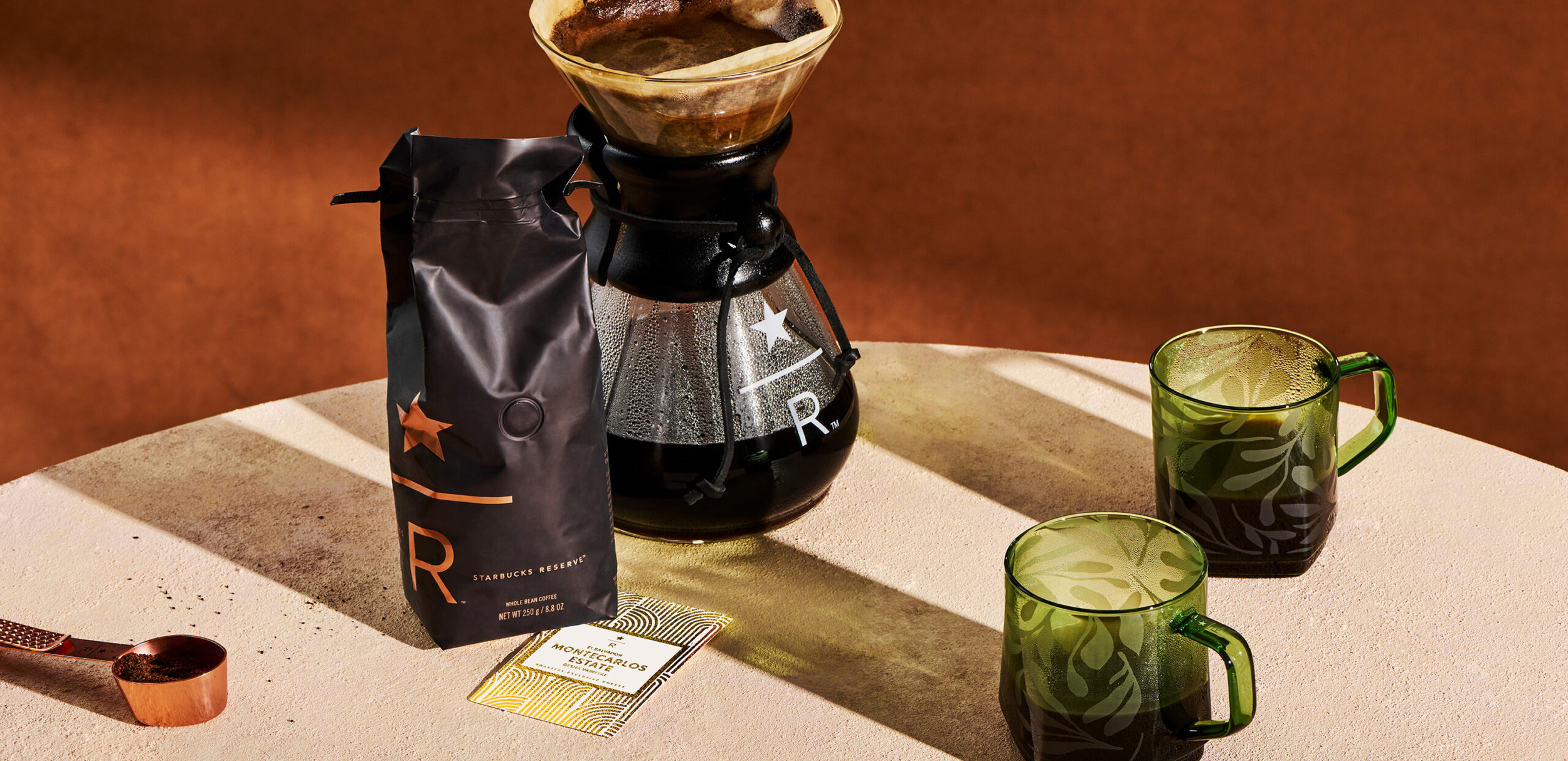
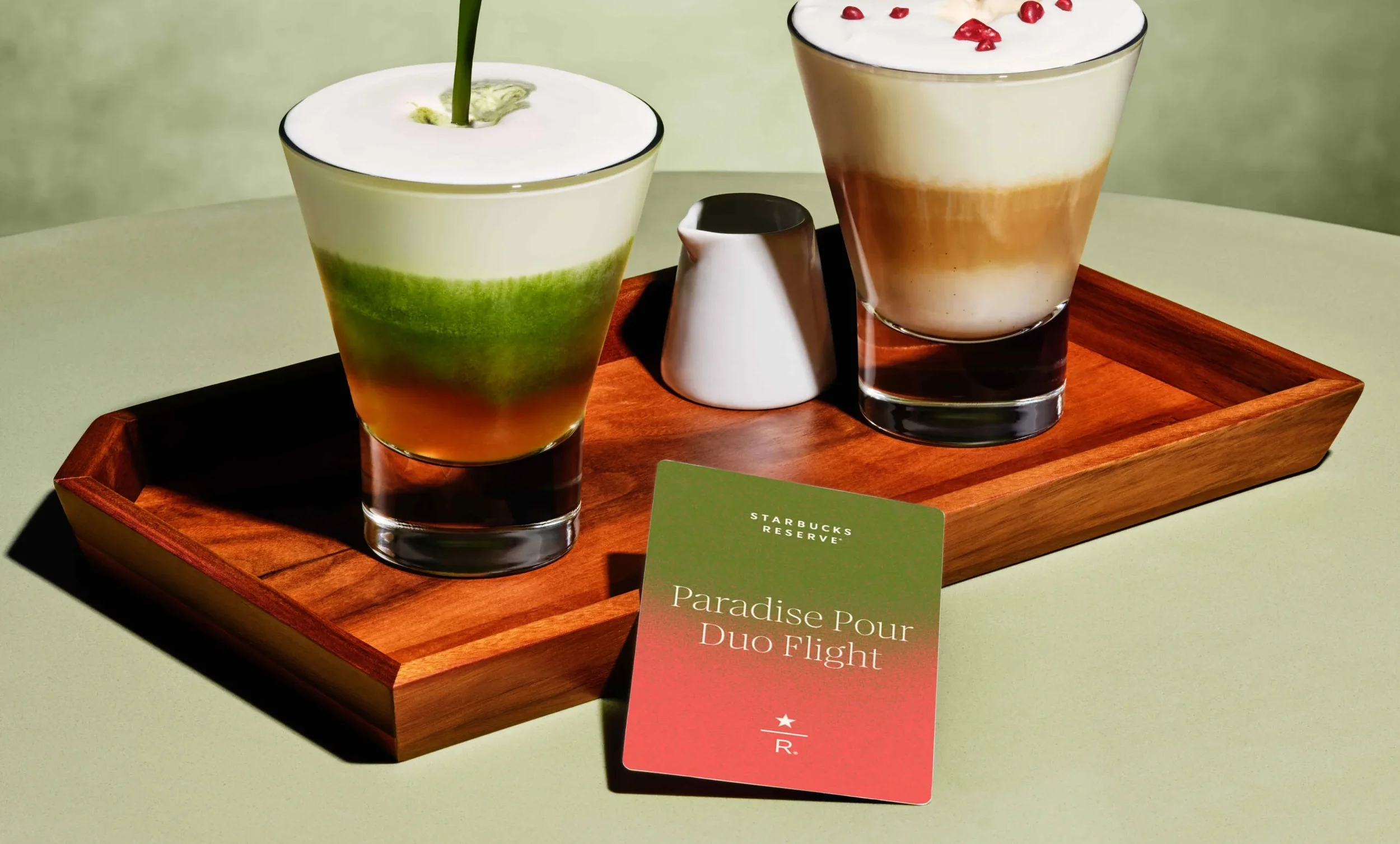
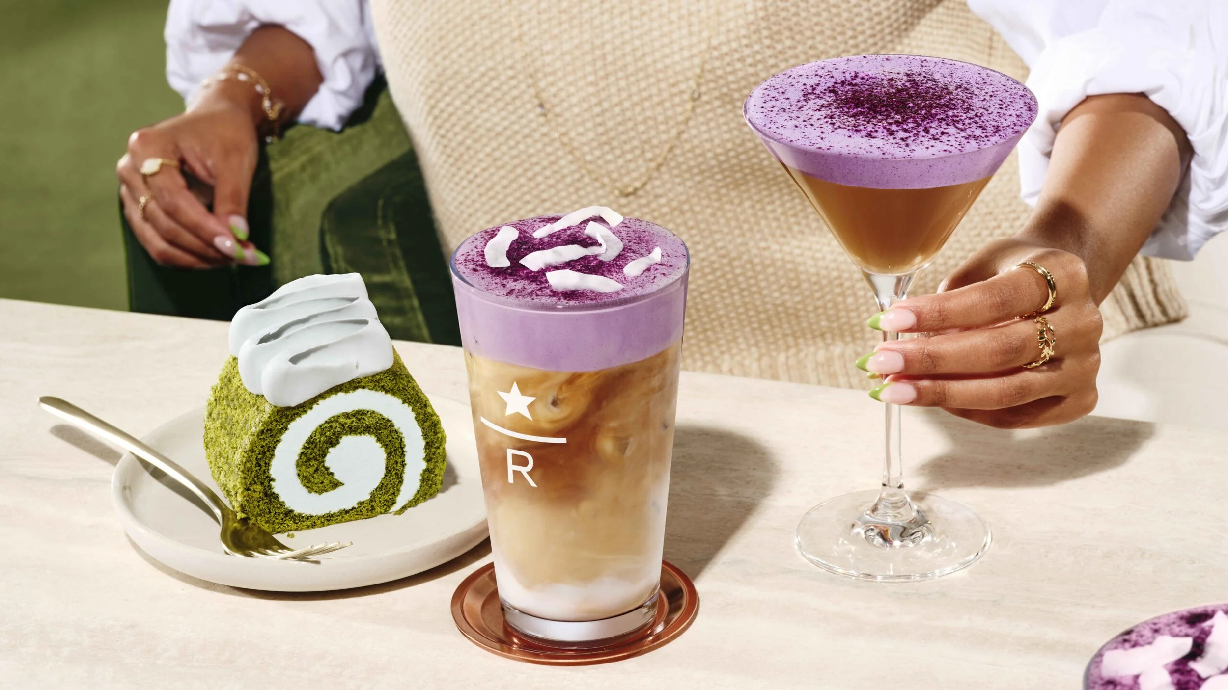
We also refreshed the photography approach, leaning into appetite appeal, rich textures, and saturated color; helping every touchpoint highlight the brand’s whimsical merchandise and product assortment. The result was a refreshed brand expression that celebrated craftsmanship, elevated the store experience, and gave the brand a unified system across the globe.